

Brief
Conceived as a private philanthropic organisation, Ray of Hope Initiative hopes to provide assistance to needy individuals or families who have no access to help elsewhere. We were tasked to design a logo that conveys the organisation's vision and philosophy.
Concept
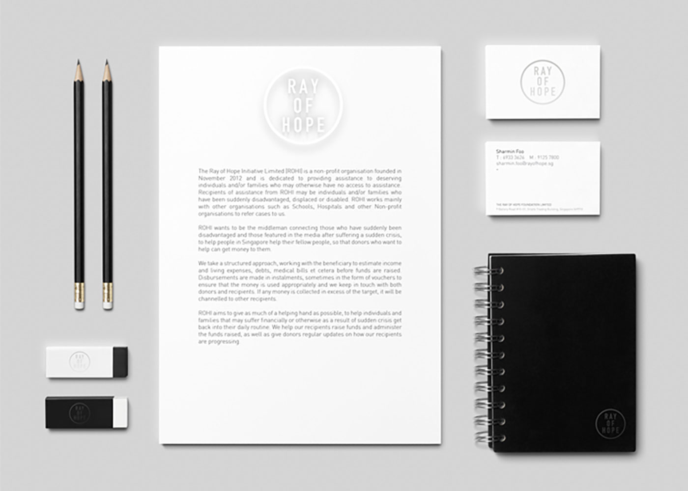
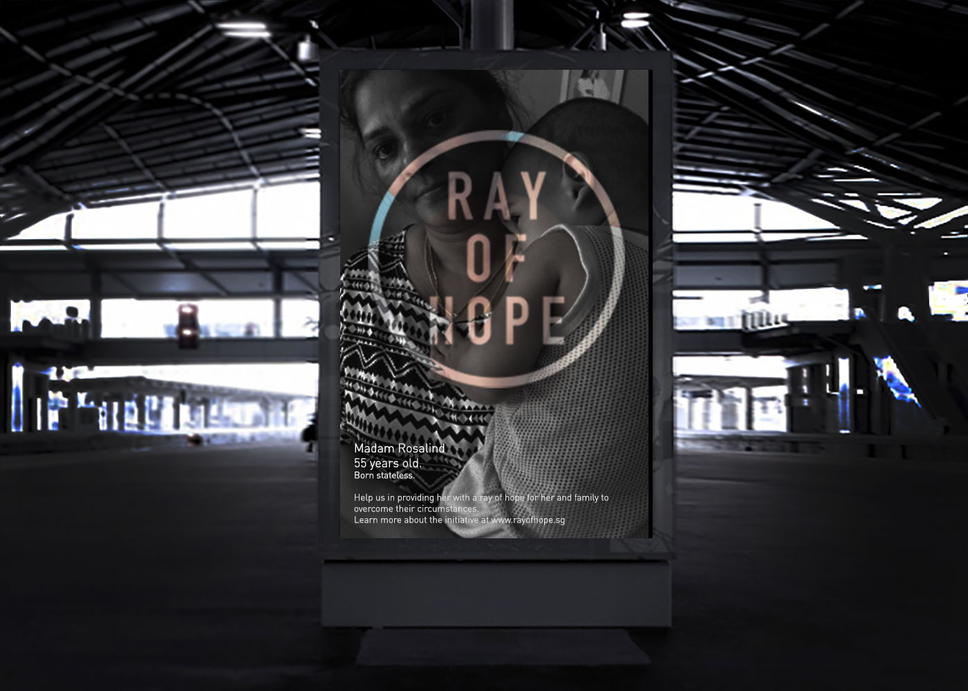
Inspired by the name itself, we wanted to bring it to life in our concept. Like how assistance provided to disadvantaged individuals brings clarity and stability to their lives, we designed a logo that becomes visible only through its interaction with a ray of light.
The logo is designed to look almost invisible — its shapes outlined by shadow cast by light — an allusion to the vision behind the initiative. This provides a dynamic system where we can play with the visibility of the logo across various communications materials.